Wednesday, 27 January 2010

More Furr

Ok I should have posted this earlier. I did do the the tasks earlier, along the the hat. See here.( about half way down)
But I didn't actually save the first texture images the first time.

So basically... I did them again and here they are.

Click to enlarge.


Brain Storming

I've already started coming up with some ideas as I don't want to be going around in circles for the first two weeks of the project. I didn't have a concrete idea until two weeks till the deadline for the last project and I don't want a repeat of that.

Anyway, I've never really been that good with story ideas, so I thought it would be a good idea to ask questions to myself about my story starters (trapeze artist, cellar and a Swiss army knife). Simple things like...

Does the Trapeze artist own the Swiss army Knife?
Does " " find the Swiss army knife?
Does " " need to get to the Swiss army knife?


Is the cellar a Wine cellar?
Does it have a low ceiling or High? (Wine cellars tend to be higher)
Is the trapeze artist trapped in the cellar, and needs to get out?
Does the trapeze artist live in the cellar?
Falls in the cellar?
Or drunk in the cellar? (on wine, that is...)

Is the Swiss army knife used as a Weapon or a tool or both?
Does it have any special gadgets, other than what you get on normal ones?

Just looking at these I could see a few possibilities for stories, weather I can tell them in as minute is... well, another story...

So far I've come up with one idea. (of which there will be many more... I hope)
In basic, it goes something like this...

It starts in the wine cellar, with the trapeze artist unscrewing yet another wine bottle with his Swiss army knife. (lots of empty bottles lying around the floor)
After guzzling that down he gets up off the floor (he was on the floor, by the way) walking to the side of the wine rack (very drunk), starts climbing up the side. (with a quick flash you see him thinking he's at the circus climbing a ladder) ... he gets to the top of the wine rack, looks down. (quick flash again back to a circus, seeing the trapeze set up in front of him) he grabs hold of the lamp shade in front of him, swings into the opposite wine rack, "peels" off of that and lands on his Swiss army knife.

I think this is too simple with not much story, but it is the first idea and is bound to change many times.

Tuesday, 26 January 2010

Unit 4 Story Telling

My personal goal for this project is to improve the quality of my blog as it has been noted many times on its thinness. So to start with I've just found a few images to go with my three random story points that came from the (I wont say curious) envelope. And here they are...

Trapeze artist
Cellar
Swiss army knife

Most of the Cellars I found, appear to be wine cellars, although I know that they can be as boring and empty as this one.


Here is an example of a trapeze artist.


When I first read the trapeze artist out of the envelope, I was thinking of Robin in Batman Forever (1995) Can you believe, I couldn't find an image of Robin from the circus scene.


I can already see some very contrasting elements for my story. A trapeze artist, (bright colours) and in a cellar (a cold, dark and damp atmosphere). And I almost forgot the obvious, Trapeze artist use wide open spaces and that is a feature which cellars lack. I have no Idea where the Swiss army knife comes into all this.


I think this just proves that you can get anything on a Swiss army knife...

Sunday, 24 January 2010

The latest Camera Task

I've just created the camera that has the guides overlayed. these images show how the guides move upon changing focal length. I know its not very clear but anyone who knows what to look for, should see what i mean.
You may have to click on the images to see them full size, to the the fuzzy image planes in the camera.


Friday, 22 January 2010

CLUEDO

I think it was the

Trapeze Artist in the

Cellar with the

Swiss Army Knife...

Thursday, 21 January 2010

My Final Tableau Vivant Style Scene and a bit more

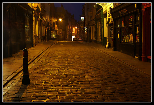
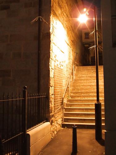
So here is my final scene... but how did I get here?


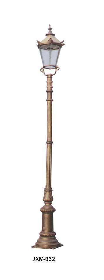
I started in Maya by creating some of the individual objects that I knew would be in my scene as I at that time I hadn't come up with the exact look of the street. The first item was the lamp post.

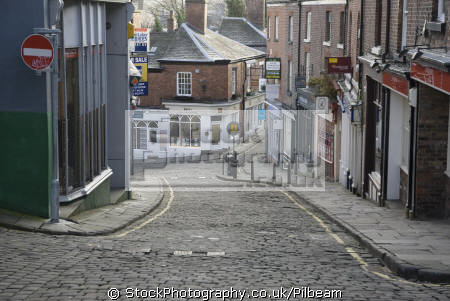
I gathered quite a few reference images. I knew sort of what I wanted it to look like. I wanted it to be concrete with a long orange light on top. All lamp posts have lights on top, I know, but I specifically said long and orange.

When I realised I was running out of time (and hadn't done any proper concept art) I decided on blocking out the scene in Maya based on my sketches reference images and a top view of the layout that I also drew out.


I went into greater detail, starting with the shops using more front and side view images which I drew straight in Photoshop.


Tidied up my scene, added the shop fronts and some more other objects.
After modeling the pavement/kerb I realised that it was just too uniform as it was all one piece of geometry, so i decided to split the kerb from the pavement and then divided the pavement into individual tiles. this allowed me to roughen up the pavement just by rotating the individual pieces.


It was then time to texture everything. Luckily I UV mapped while I modeled everything although texturing still took ages.


...and here are all the textures.


So after one and a half hours of rendering i finally got my colour pass. Final Gather was a BIG MISTAKE and the scene probably didn't really need it... oh well... at least its done.


ambient occlusion pass.
This was much quicker and only took a few minutes... not even that.


The depth pass took seconds.
I actually had to do a bit of fiddling with this image as the SALE sign on the window didn't render, so I cleverly added it in with the dark grey colour.


This is my digitally painted backdrop, they're supposed to be clouds.


A few of my favourite parts of my scene would have to be these cobbles.
The cobbles were the most tricky to get right. I realised that I couldn't just get a decent texture and use a bump map because the angle of the camera was so low down and the cobbles would just look flat. So it meant that I had to use a displacement map which actually deforms the geometry as opposed to bending the normals. (that sounds technical)


I only wished you could see all the detail I put into the pavement in the final image.


I was pleased the bucket and spade...


I tried to make the windows dirty. I just made a transparency map with dirt around the edges. for some reason no matter how clear I made it, the marks barely showed. They are there, just not noticeable unless you study the image.


It would have been nice to have the shop (that the camera is in) caked in dust, but it proved to be too complicated to get right in the time left. I experimented with fur but it looked like a grey carpet. I did ask Alan for advice and by the sounds of it, I would either have to just use a texture (although admitting that it might look fake) but would probably be better to use particles (oh no, not more technical stuff) I myself have experimented with particles in the past although have never tried creating dust. If I had an extra week, it may have been possible. Who knows...

I only wish I had some sort of proper digital concept painting, but I was struggling to get my scene onto paper (or should I say Photoshop) because of changing my idea half way through the project, I could see that I was running out of time.

Essay on Doctor Who

Ive completed my essay. I've been looking at the uncanny in relation to Doctor Who. I only focused of a few specific alien characters. To be honest, I actually done most of the essay within the first week and only needed a few tweaks here and there. I admit that a lot of my knowledge actually came from what I already knew about Doctor Who, but I did get a few books on the subject too. This was probably the reason why I was able to get started so much quicker. Ive just realized that several other people have based their essays on Doctor Who.

Maya Tasks


Ive just completed the Maya tasks. I had no problems with it. when duplicating objects as an instance does that include the texture mapping as well? basically what i did was instead of creating 10 texture reference objects, i instead done one texture reference for the first and then duplicated as an instance. It seemed to work although i don't know that i would be able to tell with the cloud 3d texture so I'm asking if that would work?


Wednesday, 20 January 2010

Our Wonderful Nature Animation Short

Our Wonderful Nature is a short animation directed by Tomer Eshed.
I enjoyed it. It started so realistically, both sounding and looking but switched to this semi cartoony, semi realistic and humorous fight sequence between two animals. the animation is probably the best i've seen out of the short animations being shown so far and is almost flawless (although not perfect). It starts with this David Attenborough style narration which sounds so serious until Matrix style fighting begins. The panning around shots where cleverly done by messing around with the focal length and the zoom. It almost made me dizzy. Just like real nature programs, there are the slow motion camera shots. (technically the whole fight scene was in slow motion but had slower slow motion scenes too.) This just made the whole thing funny.

Just Amazing to watch...

Friday, 15 January 2010

hello

Ive spent the last couple of days just working on my scene in maya. getting stuck at the concept art stage, I decided that for the momnet i would just relie on alot of reference images of shops roads etc and draw some simple front side views of the things in my scene.

My scene is mostly modleled and UV Mapped and still needs texturing and lighting and anything that comes after that.

The lighting here is just a test and will be re done from scratch when the scene is more complete.


This is just a series of quick sketches, comming up with a logo for the fish n chip shop in my scene


and a front and side view of my shops. You will only see the corners so am keeping the design mostly the same.


this was an older concept, i dont think i have posted. this shows the kind of lighting im aiming for. It is actualy half done in maya and half photoshop.


reference images galore.


Tuesday, 12 January 2010

Poltergeist and Blue Velvet

Poltergeist was directed by Tobe Hooper although was written, produced and many other things by Steven Spielburg. It was made in 1982.
I enjoyed most of the film although it began to get repetitive at the end.
I thought the ghost effects looked very much like the effects in Ghostbusters. The smokey, streaking effects were similar too. I would have said that Poltergeist borrowed that look from Ghostbusters but Ghostbusters came second.


Although Sky Movies reveiwed it as the scariest movie yet, I find that hard to believe. The ghost effects looked almost exactly the same as Ghostbusters, which I did find scary when I was little, it doesn't scare now. The scarier moment in Poltergeist were when the spooky tree and the clown were just there, not moving... waiting for something to happen. This film relied on scares being created by scary looking things which is in complete contrast to films like Halloween and the haunting where suspense and the unknown are used. In a way this film has dated a lot and could only really scare kids and is more of a fun enjoyable film for those that aren't scared of ghosts and monsters. Alot of the other films we have watched have been subtler in how they show this evil in American suburbia.

The evil in Poltergeist was super natural but in Blue Velvet, it was realistic.

Blue Velvet was made in 1986 and directed by David Lynch.


The film starts all bright and ordinary. but when an ear is discovered, it is thought that something sinister is going on.


That ear belongs to a hostage held by this evil character called Frank. the hostage has a wife and a son and the son is also held hostage. Frank wanted control over the wife who is a singer in case you didn't know. Frank is a violent person who is weird. Then there the guy who discovered the ear who wants to be the detective and solve the crime. He gets involved more than he anticipated. There is also a corrupt police officer who wears a yellow suit. Another bright colour to go with the red of the roses. We would think that he is one of the good guys not just because he is a policeman but because he wears a summer colour, the same colour scheme as the intro to the film, where everything is perfect. All the violent parts of the film take place at night. This keeps the bad stuff hidden from the rest of the people, who only see the bright side of suburbia.

I didn't enjoy Blue Velvet. I found most of it boring as it felt more like a series of events. I also thought that the film couldn't decide what type of film it was as it drifted between themes. For that reason I didn't like it either. They went into great detail with the characters. The ending of the film was the same as the beginning but in reverse, the film was semi resolved. It was basically a detective story.

Friday, 8 January 2010

Reference Images of Streets and Street Lamps

I have started working in Photoshop to create a my scene although haven't got very far because of the lack of reference images so since its rather difficult to get anywhere at the moment. I've searched the internet and found some images which show exactly the type of lighting I'm after. There are also some pictures of different styles of lamp posts. I want have something to model in Maya while still working on the design of the street and since they are a necessity, it only makes sense to start the small things (such as the lamp posts) now to lighten the load of modeling later on.
I still need better images of the buildings in streets.
I took the last photo myself.


This is exactly the sort of lighting I want in my scene.